
︎
︎
Client
︎︎︎ SIZE?
Project
︎︎︎ SIZE? BRAND IDENTITY & INSIGHTS
︎︎︎ SIZE?
Project
︎︎︎ SIZE? BRAND IDENTITY & INSIGHTS
︎
size? tasked us with exploring the legacy of their branding with a view to revitalising how it’s used throughout their business. To protect the process from any internal biases, we conducted an in depth qualitative and quantitative insights project focused on the size? consumer to dive deeper into how the brand is perceived.
The insights revealed that the brand identity works, but required a more forward−thinking approach to remain relevant. Our response was to consolidate the existing strengths, focus on the best-perceived brand assets and lay the framework for ongoing variation around the core identity to keep things fresh.
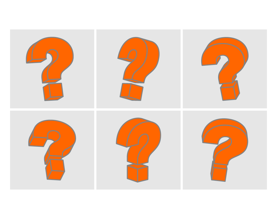
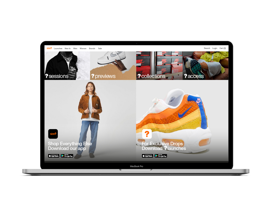
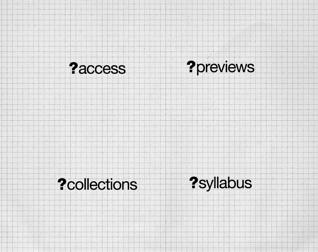
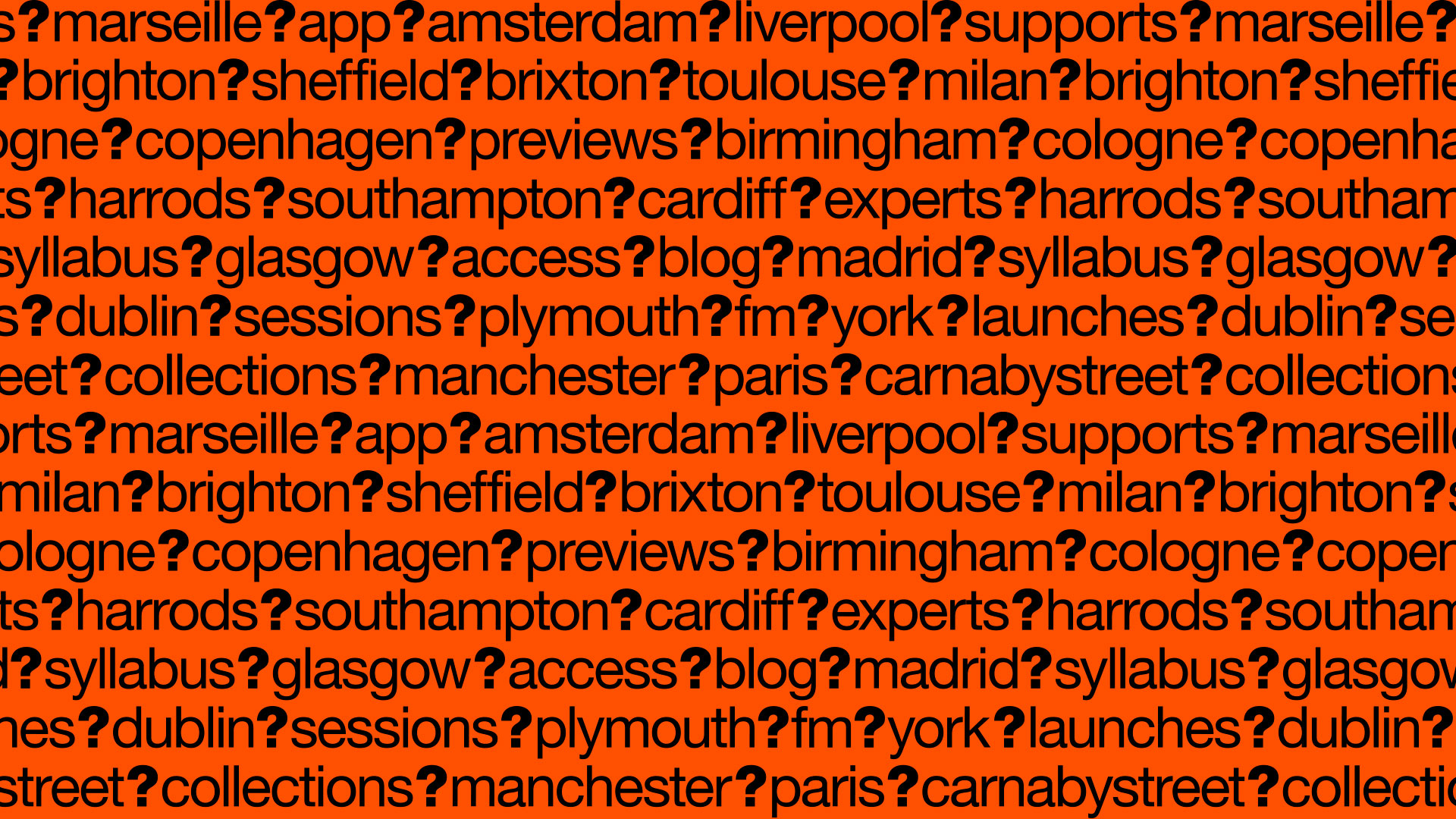
We moved the question mark to the primary logo, used where possible to increase brand equity. The size? wordmark is used where more explicit branding is required. Typography is consolidated and expanded to include more weight options and graphic executions. Motion, asset variants and graphic elements can be added to liven up the aesthetic without undermining the core brand consistency.
The insights revealed that the brand identity works, but required a more forward−thinking approach to remain relevant. Our response was to consolidate the existing strengths, focus on the best-perceived brand assets and lay the framework for ongoing variation around the core identity to keep things fresh.
We moved the question mark to the primary logo, used where possible to increase brand equity. The size? wordmark is used where more explicit branding is required. Typography is consolidated and expanded to include more weight options and graphic executions. Motion, asset variants and graphic elements can be added to liven up the aesthetic without undermining the core brand consistency.